安装 Steam
登录
|
语言
繁體中文(繁体中文)
日本語(日语)
한국어(韩语)
ไทย(泰语)
български(保加利亚语)
Čeština(捷克语)
Dansk(丹麦语)
Deutsch(德语)
English(英语)
Español-España(西班牙语 - 西班牙)
Español - Latinoamérica(西班牙语 - 拉丁美洲)
Ελληνικά(希腊语)
Français(法语)
Italiano(意大利语)
Bahasa Indonesia(印度尼西亚语)
Magyar(匈牙利语)
Nederlands(荷兰语)
Norsk(挪威语)
Polski(波兰语)
Português(葡萄牙语 - 葡萄牙)
Português-Brasil(葡萄牙语 - 巴西)
Română(罗马尼亚语)
Русский(俄语)
Suomi(芬兰语)
Svenska(瑞典语)
Türkçe(土耳其语)
Tiếng Việt(越南语)
Українська(乌克兰语)
报告翻译问题














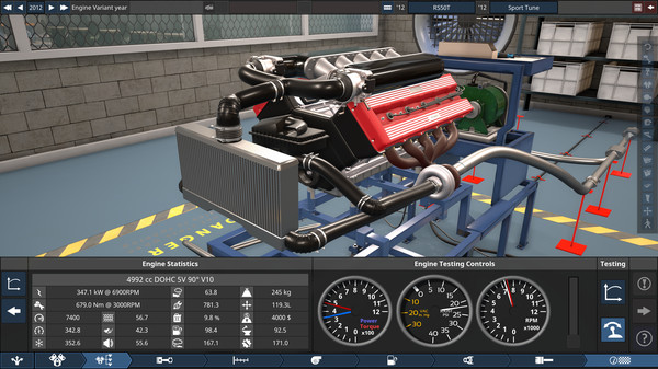


So I tried your UI mod for workers and I have to say it looks really good:)
Just one comment, and that's about the text for the categories, it seems to me that it's exactly in the border line, which doesn't look good to me and that text should be a little bit higher. I'm attaching screenshots:
https://i.postimg.cc/tR2bCT0M/screenshot-1938.png
And a second smaller detail, the transition between the white and gray background goes right through the top part of the images, shouldn't it be exactly at the level of their top edge? These two tings are the only ones which come right to my eyes..
https://i.postimg.cc/R055bJfN/screenshot-1939.png
I know that these are visual details, but I think that's the only thing that bothers my eyes a little. If it could be adjusted of course.
P:S: Yes I use Slovak language:)