安装 Steam
登录
|
语言
繁體中文(繁体中文)
日本語(日语)
한국어(韩语)
ไทย(泰语)
български(保加利亚语)
Čeština(捷克语)
Dansk(丹麦语)
Deutsch(德语)
English(英语)
Español-España(西班牙语 - 西班牙)
Español - Latinoamérica(西班牙语 - 拉丁美洲)
Ελληνικά(希腊语)
Français(法语)
Italiano(意大利语)
Bahasa Indonesia(印度尼西亚语)
Magyar(匈牙利语)
Nederlands(荷兰语)
Norsk(挪威语)
Polski(波兰语)
Português(葡萄牙语 - 葡萄牙)
Português-Brasil(葡萄牙语 - 巴西)
Română(罗马尼亚语)
Русский(俄语)
Suomi(芬兰语)
Svenska(瑞典语)
Türkçe(土耳其语)
Tiếng Việt(越南语)
Українська(乌克兰语)
报告翻译问题


Took a while myself, too. But added the link in the description.
Sorry it took a while but the modified mod is up.
https://psteamcommunity.yuanyoumao.com/sharedfiles/filedetails/?id=1592759300
The changes are subtle enough for someone used to the vanilla setting to recognize them easily but impactful enough to tell the actual difficulty at a first glance instead of sometimes having to check manually by clicking.
No, I don't mind at all. It's appreciated, even.
Actually, feel free to publish it as a seperate mod yourself. I'll throw a link to it in the description here.
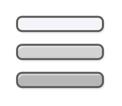
I hope you don't mind but I modded you mod. Added some markers beside the icons to indicate difficulty.
Here's a preview if you want to check it out:
https://imgur.com/a/ZlaiEL9
If you to update the mod with these changes, just let me know and I'll send you the files.
Cheers!
Alas, I don't trust my artistic skills very much beyond what I'm doing here.
I did consider just upping/lowering the brightness levels to the point it would obviously go light-medium-dark even in grayscale, but I didn't like the look of it.
I might give it another look, but I'm afraid you'd be better off with a modder who's a bit more at home with image manipulation/editing.
Someting like adding a border that gets more foreboding with the higher ranks or just something simple like putting a mini skulls down the side. As stuff like that can be more recognisable at a first glance, no matter what kind of colour-blindness someone has.
windows 10 has options that help with colorblindness (even specific types, and I believe you can scale colours to even better suit), but this just gives that extra little kick for Darkest Dungeon
That said, I'm kinda doubtful my changes go far enough for people who are a bit stronger Red-Green blind, but I'll consider making another palette if there's feedback requesting it.
Oh, and yeah, cyan for The Color of Madness should be fine. Nowhere near what I see as these three main colours.
Heh. I'm scratching my head a little at your description of "a bright, lurid, neon cyan", though - 'cause to me cyan is the most 'desaturated' colour - pretty close to a light-grey-with-a-little-blue thing.
Not sure if it helps you at all, but just so you know for the expansions: The Colour of Madness does indeed have a different quest selection icon; it's a bright, lurid, neon cyan colour, so quite different from the main three, but I don't claim to know anything about colour blindness, so not sure if it will be an issue or not